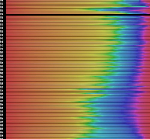
Colours in movie posters from 1914 to the present
by Toby Woollaston
Here’s an interesting study. Vijay Pandurangan has analysed the colours in movie posters from 1914 to the present. Here’s his graph (with the most recent years at the bottom). Look at the increase in cyan and reduction in magenta in recent years. Indicative of colour grading technologies and the trend towards a cooler palette contrasted with warm oranges. Not too sure what happened in 1924.

