Month: October, 2016

The Red Turtle


rtThe Red Turtle has recently done the rounds of the film festival circuit, including our own New Zealand International Film Festival. A collaboration between Studio Ghibli and Oscar-winning Dutch born writer-director Michael Dudok de Wit (Father and Daughter) makes for an interesting fit. Dudok de Wit has applied his hand solely to short films to date, so it must have been an interesting turn of events that convinced him to work on a feature film with an animation studio from half a world away in distance and style.  It took a decade to make, but make it they did, and the result is a genuine treat.

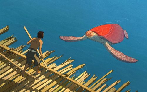
Entirely dialogue free, the film tells the simple story of a man (we never know his name) castaway on a deserted tropical island. His attempts to escape the island by a raft made of bamboo are repeatedly thwarted by the titular red turtle. Consequent to seeking his revenge upon the turtle, the film uncannily unfolds into a fantastical fable that explores themes of companionship, family, grief and man’s bond with nature … ultimately to its poignant and moving end.

The film’s art style is stunning and mimics the purity of its narrative, with clean lines and hyper-simplistic characters with simple dots for eyes, set against a painterly backdrop of the sea, sky, and island.  There is a palpable splicing of Japanese and European art styles, almost as if Tintin walked onto the set of Ponyo.

A minimalist pace and lack of dialogue allows space to ponder what is presented before your senses rather than having to play catchup on any lengthy expositions.  This is a refreshing approach and perhaps necessary of a film that implores us to look at nature through a simple lens. However, it is the provocative ambiguity that remains the film’s most attractive feature, and as such I was left basking in its tantalisingly elusive meaning for days after viewing — it’s almost as if the film is daring you to draw your own conclusion rather than present one for you.

Despite the Studio Ghibli pedigree, the slow pace means that audience patience, rather than subject matter, might make the film inaccessible to younger children. Although, I think perseverance in this instance would have its rewards, as this is a masterclass in sensory story telling. Look out for this film in the new year … it is definitely worth the wait.

Star rating: 4.5 stars.

Advertisement

Sing Street

sstrIrish writer-director, John Carney, has had a string of hits and misses in his career. His surprise triumph, Once, beautifully expressed a delicate love story through song and picture and garnered critical success. However, Carney’s mojo quickly evaporated with his subsequent releases Zonad, and the recent foray into America with Begin Again, which was met with a tepid reception. His latest feature, Sing Street goes a long way to restoring his creditability as a director who can blend an authentic heart-felt story with music. Set in 1985 among the schooling milieu of a depressed Dublin, Sing Street ostensibly operates as an autobiography of Carney’s musical upbringing.

Conor (Ferdia Walsh-Peelo), a high school student, admires Raphina (Lucy Boynton) from afar. In an effort to impress her, he inadvertently paints himself into a corner by inviting her to a film shoot for his band. The only problem is that he doesn’t have a band yet. Conor does the only thing he can do in the situation – round up an eclectic bunch of students and start a band named Sing Street (a play on Synge Street, the public school that has been thrust upon Conor by his troubled parents).

Thankfully, Conor’s interest in music is already established and his pot smoking older brother Brendan (Jack Reynor), who also operates as his mentor, goes a long way to teaching him the ins-and-outs of the current day musical trends. Queue music from The Cure, The Jam, Duran Duran, Motörhead, Hall and Oates, Joe Jackson (even Genesis gets a look-in) as Conor reinvents himself and his band from image to image. Thankfully Sing Street stops short of attempting an exhaustive exploration of music from the era – a move that would certainly cheapen the film’s musical homage. Instead, it keeps at its core the progression of Conor’s relationship with Brendan, Raphina, and his pursuit towards greater musical endeavours.

Not an out-and-out musical compared with the likes of Grease or Hair SpraySing Street‘s musical antics are more diegetic in nature, but just as playful. It keeps itself rooted in Carney’s memory of Dublin in the eighties resulting in a presentation more akin to The Commitments … or perhaps a musical version of Son of Rambo is more accurate. Far from overcooked, as many films from this genre often are, Sing Street is a fun film and a delightful nostalgic kick. Sing Street is due for release on DVD/Blu-ray and on demand on 26th October. Definitely worth a look.

Star rating: 4/5

See the published review here.

Cinematic complexion and “feeling” colour: Pi

pibarcode


I have explained in a previous post the significance of cinematic colour complexion to aid our ability to “feel” a film. You can read my entire thesis on Aronofsky and phenomenology by following this link. In my series on the use of colour in Aronofsky’s first five feature films I will conclude with the barcode of  Aronofsky’s only black and white feature film, Pi.

Although this investigation into colour excludes Pi, there are still some salient points that can be garnered from its “colour” barcode. I have illustrated that Aronofsky’s first four colour films make deliberate use of their tonal range. Pi‘s tonal range, albeit monochromatic, is also employed deliberately. Where the other films favour a hue to communicate and engage the cinesthetic subject, Pi achieves the same through the monochromatic treatment used to portray Max. For this character (who is constructed as being somewhere on the autistic spectrum), the world is black and white, reduced to a binary world of numbers and mathematical equations. Max’s world is presented in monochromatic terms. This is evident in Pi‘s “colour” barcode, with its binary nature presenting frames of deep blacks or stark whites. In Pi‘s synthetic world, black tones are either on or off, and are emphasised by chiaroscuro lighting and high-grain film (shot in high-contrast black and white reversal film stock). The feel of the film, which is insistently stark, aggressive, and high contrast, emphasises the obsessive nature of Max’s quest for a mathematical answer to the world: “I’ll find this structure, this order, this perfection.” The binary nature of Pi‘s cinematography leaves little room for the middle ground of greys and soft lighting. Grey is associated with the realm of nature, which the film only shows twice: first when Max visits the beach post-seizure, and then, significantly, at the end of the film after Max has had a mental breakdown, thus escaping his mathematical obsession. In Pi‘s final moments Max looks at the trees in blissful ignorance of the mathematical world. The trees sway in the soft greys and Pi‘s final softer tones suggest to the spectator, through cinesthesia, an experiential return to nature.

In conclusion, what is immediately apparent when examining the colour barcodes and signatures of Aronofsky’s four colour feature films is how they all differ in their dominant hue and shade. The role that colour plays in feeling these films cannot be understated. Colour not only provides a background, colouring the spectator’s mood so to speak; but more importantly, hue and shade are not static but shifting, assisting mood change. As illustrated in my previous posts, the films present the change of hue and shade deliberately — to generate a non-cognitive feeling state cinesthetically, which alters the mood of the spectator.

The Girl on the Train

tgott_620x310
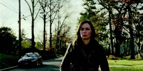
It’s a question everyone asks – was the book better than the film? To me it seems a fruitless inquiry as they are such dramatically different mediums. In most cases the book wins out, simply because it allows the reader to imagine a picture, whereas the film has the onerous task of presenting that picture … which differs for everyone. In this instance, I saw The Girl on the Train having not read the book. So, I was charged with reviewing the film on its own terms rather than having to consider screenwriter Erin Cressida Wilson’s treatment of Paula Hawkins’ best-selling pot boiler.

As a proto-feminist thriller, The Girl on the Train does not tread lightly on themes of motherhood, identity, and displacement. The first half slowly unfolds as a psychological drama that introduces three women and the gender politics that play out in their homes.

Star rating: 4/5

See the published review here.

The Magnificent Seven

mag7_620x310
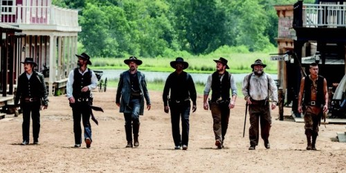
I regretfully admit that I have not yet seen the 1960 version of The Magnificent Seven (which was originally based on Akira Kurosawa’s 1954 Japanese classic, Seven Samurai). In fact, the whole western genre is a bit of a blind spot for me. However, the positive is that I can look at Antoine Fuqua’s (Training DayThe Equalizer) remake with fresh eyes rather than compare it to the original. Apparently I’m in good company – the film’s star, Denzel Washington, citing similar reasoning, didn’t see the original either.

The plot is relatively simple. Set in 1879, Bartholomew Bogue (Peter Sarsgaard) and his gang roll into town and demand the townsfolk sell their land to him at a cut price. He gives them three weeks to comply before he comes back and takes the town by force. Emma Cullen (Haley Bennett) and her friend Teddy Q (Luke Grimes) head out to a nearby town to enlist help. There they find Warrant Officer Sam Chisolm (Denzel Washington), who in turn, enlists six other guns for hire (Chris Pratt and Ethan Hawke among them). Together they nut out a battle plan before Bogue and his heavies return. You can imagine what happens next.

So, how do we justify this remake? Why now? Was there something new and fresh to be told, or was it simply a commercial cash grab? I can see the thinking – conjure up a familiar but compelling plot worthy of recycling, add some heavy hitting actors, and we might just have a hit on our hands. This rationale is fine, but if you’re deciding not to tread on new ground then it puts a heavy onus on “entertainment”.

Here, unfortunately entertainment took a back seat to box ticking. Variation of ethnicities and backgrounds – tick. Stage it like the original classic – tick. Ensure a big finale – tick. Get big name actors – tick. All boxes were checked successfully, yet this film still felt vacuous. The variation of ethnicities felt like they were meeting quotas, with little opportunity given to explore their rich backgrounds. The result left me with a seven that was more “meh”gnificent than magnificent. The staging was so drawn-out and overemphasised it felt too heavy-handed. The long and overcooked finale was a path of violence that left a town so devastated it was barely recognisable. I had to ask myself what the point was. Perhaps Fuqua was angling for a cynical view of violence as a tool to solve disputes. Who knows? Moreover, who cares … I certainly didn’t.

Star rating: 2/5

See the published review here.


Cinematic complexion and “feeling” colour: Black Swan

bsbarcode

I have explained in a previous post the significance of cinematic colour complexion to aid our ability to “feel” a film. You can read my entire thesis on Aronofsky and phenomenology by following this link. Here I will illustrate this with the colour signature and barcode of  Aronofsky’s fith feature Black Swan.  The colour signatures are a consolidation of all the colours used in a film and serve to distinguish a film’s propensity to lean towards a particular hue. The signatures are broken down into the RGB (red, green, blue) colour-space and the values represent the brightness of each hue (the higher the number the brighter the hue). The colour barcodes represent the colour of each frame in the film. Each frame has been captured and squeezed into a strand of colour. When the colours are placed side-by-side chronologically, the result reads like a colour barcode of the film. Starting from the beginning of the film at the left, the barcode can be read as a colour timeline and indicates the dominant colours for large portions of the film.

Visually, Black Swan is a darker film than either Requiem for a Dream or The Wrestler. Despite the film’s binary nature (purity vs. corruption, light vs. darkness, white vs. black), its colour signature and barcode patterns do not, on initial inspection, reflect this quality. The film’s dualism is explicit in the transformation of Nina from white to black swan. As expected, many elements within the mise-en-scène are portrayed through a desaturated, almost monochromatic palette, aiding the theme of white versus black. Characters in Black Swan are framed in a way that emphasises their costumes. In her naive and repressed state, Nina wears monochromatic costumes dominated by lighter shades of white, pale pinks, and light greys; whereas her antagonists, Lily (Mila Kunis) and Nina herself (as the black swan — her other self), wear darker monochromatic shades (predominantly black). However, the colour signature of the film exhibits a dominant red hue, which seems to be at odds with the monochromatic colour palette of the characters’ costumes. An explanation for this could be that pale pink indicates white and dark red indicates black. Black Swan discreetly exhibits a significant quotient of red hue contained in other elements within the mise-en-scène, such as the small but bright flashes of red lipstick, dark red blood, the black swan’s eyes, the saturation of red light in the night-club, and the stage lighting in the climactic black swan transformation. Furthermore, there is also a heavy use of pink in Nina’s bedroom, e.g. her soft toys — this colour being a derivative of the red hue. These elements are easily overlooked due to the conflict between white and black. However, the link between pink and dark red equates to the same conflict. What is evident in Black Swan‘s colour barcode is the film’s temporal transformation from pink to dark red. The film begins with red mixed with white, and as the film progresses, the same red is mixed with black. Therefore, red is the constant with the differentiate being the amount of white or black. The pink/darkred dichotomy equates to the white/black dichotomy, and the latter controls Nina’s transformation from innocence to corruption, from white to black swan. Pink indicates white, and dark red indicates black. As the film’s complexion changes, so too does the mood of the spectator. The spectator’s embodied cinesthetic experience allows the colours of Black Swan to be felt non-cognitively, as if they were monochromatic shades of white or black, allowing for a shift of mood that again is a descent into anxiety that parallels Nina’s descent into mental illness.

Pete’s Dragon

pdI am always on the look-out for a holiday film that draws out deeper reactions in my kids than a couple of cheap laughs. A few years ago, I took them to see Spike Jonze’s superb Where the Wild Things Are. Fair to say I was impressed by how complex themes were drawn out of Maurice Sendak’s seemingly innocuous 1973 book of the same name. It appeared to me that Pete’s Dragon might just have the same opportunity.

Penned by Seton I. Miller and S.S. Field, Pete’s Dragon was originally an unpublished short-story that eventually found its way onto the producer’s desk of Disney’s 1977 animated/live-action film of the same name. I don’t want to make any comparisons with this earlier film due to its completely different treatment of the source material. Also, despite being beloved by many, it really wasn’t very good.

The titular Pete (Oakes Fegley) is a ten year old orphan who lives in the woods and claims to have a friend named Elliott … who happens to be a friendly dragon. Grace (Bryce Dallas Howard), the local forest ranger (and burgeoning mother figure), is curious about Pete’s stories of a large green dragon, in part because they remind her of her dad’s (played by the abiding Robert Redford) tales of a fierce dragon that resides within the woods. So, with the help of her 11-year-old step daughter (Oona Laurence), Grace sets about discovering Pete’s origins.

At its core Pete’s Dragonappears to draw direct inspiration from authors such as the Leprince de Beaumont, Kipling, or Burroughs. Key similarities to protagonists such as The Beast, Mowgli, or Tarzan suggest that the story has at the very least unknowingly dipped its toes into such works of the fantastic. It treads lightly on the notions of marginalised groups being perceived as a threat by society, but thankfully stops short of any darker subtexts.

David Lowery, who directed and also adapted the screenplay along with Toby Halbrooks, has crafted a film that clearly markets itself as a feel-good film. With moments of unabashed cheesiness there is no mistaking Disney’s genes here, but these are outweighed by the film’s honest form of story telling and a remarkable performance by the young Oakes Fegley. As such Pete’s Dragon is a noble effort at a feel-good humanist film … with a dragon.

Star rating: 3.5/5

See the published review here.