
Cinematic complexion and “feeling” colour: Black Swan
by Toby Woollaston
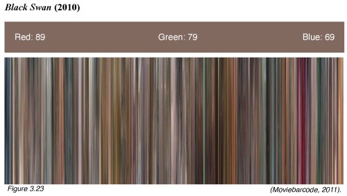
I have explained in a previous post the significance of cinematic colour complexion to aid our ability to “feel” a film. You can read my entire thesis on Aronofsky and phenomenology by following this link. Here I will illustrate this with the colour signature and barcode of Aronofsky’s fith feature Black Swan. The colour signatures are a consolidation of all the colours used in a film and serve to distinguish a film’s propensity to lean towards a particular hue. The signatures are broken down into the RGB (red, green, blue) colour-space and the values represent the brightness of each hue (the higher the number the brighter the hue). The colour barcodes represent the colour of each frame in the film. Each frame has been captured and squeezed into a strand of colour. When the colours are placed side-by-side chronologically, the result reads like a colour barcode of the film. Starting from the beginning of the film at the left, the barcode can be read as a colour timeline and indicates the dominant colours for large portions of the film.
Visually, Black Swan is a darker film than either Requiem for a Dream or The Wrestler. Despite the film’s binary nature (purity vs. corruption, light vs. darkness, white vs. black), its colour signature and barcode patterns do not, on initial inspection, reflect this quality. The film’s dualism is explicit in the transformation of Nina from white to black swan. As expected, many elements within the mise-en-scène are portrayed through a desaturated, almost monochromatic palette, aiding the theme of white versus black. Characters in Black Swan are framed in a way that emphasises their costumes. In her naive and repressed state, Nina wears monochromatic costumes dominated by lighter shades of white, pale pinks, and light greys; whereas her antagonists, Lily (Mila Kunis) and Nina herself (as the black swan — her other self), wear darker monochromatic shades (predominantly black). However, the colour signature of the film exhibits a dominant red hue, which seems to be at odds with the monochromatic colour palette of the characters’ costumes. An explanation for this could be that pale pink indicates white and dark red indicates black. Black Swan discreetly exhibits a significant quotient of red hue contained in other elements within the mise-en-scène, such as the small but bright flashes of red lipstick, dark red blood, the black swan’s eyes, the saturation of red light in the night-club, and the stage lighting in the climactic black swan transformation. Furthermore, there is also a heavy use of pink in Nina’s bedroom, e.g. her soft toys — this colour being a derivative of the red hue. These elements are easily overlooked due to the conflict between white and black. However, the link between pink and dark red equates to the same conflict. What is evident in Black Swan‘s colour barcode is the film’s temporal transformation from pink to dark red. The film begins with red mixed with white, and as the film progresses, the same red is mixed with black. Therefore, red is the constant with the differentiate being the amount of white or black. The pink/darkred dichotomy equates to the white/black dichotomy, and the latter controls Nina’s transformation from innocence to corruption, from white to black swan. Pink indicates white, and dark red indicates black. As the film’s complexion changes, so too does the mood of the spectator. The spectator’s embodied cinesthetic experience allows the colours of Black Swan to be felt non-cognitively, as if they were monochromatic shades of white or black, allowing for a shift of mood that again is a descent into anxiety that parallels Nina’s descent into mental illness.
