Cinematic complexion and “feeling” colour: The Wrestler
by Toby Woollaston
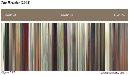
I have explained in my previous posts the significance of cinematic colour complexion to aid the spectator’s ability to “feel” films. You can read my entire thesis on Aronofsky and phenomenology by following this link. Here I will illustrate this using the colour signature and colour barcode of Darren Aronofsky’s fourth feature film, The Wrestler (2008). This signature and barcoding technique offers a concise visualisation of a film’s dominant colours. The colour signature (the solid bar above the barcode) is a consolidation of all the colours used in a film and serves to distinguish a film’s propensity to lean towards a particular hue. The signature is broken down into the RGB (red, green, blue) colour-space and the values represent the brightness of each hue (the higher the number the brighter the hue). The colour barcodes (below the colour signature) represents the colour of each frame in the film. Each frame has been captured and squeezed into a strand of colour. When the colours are placed side-by-side chronologically, the result reads like a colour barcode of the film. Starting from the beginning of the film at the left, the barcode can be read as a colour timeline and indicates the dominant colours for large portions of the film.
Upon initial inspection it would appear that The Wrestler employs minimal colour manipulation, due to its realist sensibilities. However, the intentionality of the film is still significantly expressed through its use of colour, in particular red and green. Of the five films studied, The Wrestler is clearly Aronofsky’s most realistic in terms of story and setting, which is supported by an aesthetic that uses a more natural palette. The film’s complexion is lighter than that of either The Fountain or Black Swan, although the colour barcode exhibits oscillating patterns of lighter and darker periods. The latter are often representative of Randy’s life outside of the ring and are located at the seedier or more depressing moments in the narrative, such as Randy’s trailer park home, the strip club, and Randy’s troubled moments with his daughter, Stephanie. The colour signature indicates a dominant green hue that reflects Randy’s work-place in and around the wrestling ring, whereas his life outside of the ring often contains a higher instance of the red hue. Perhaps the most notable example is the strip club where Cassie (Marisa Tomei) works, which is heavily saturated with red. This colour is diametrically opposed to the green hue, largely associated with Randy’s life as a wrestler. What is evident is the play between green and red, where red codifies Randy’s life outside the wrestling ring and green codifies his life inside the ring; red is also the dominant hue in the darker periods and green is dominant in the lighter. Furthermore, the concluding chapter of the film combines the two colours as Randy’s two worlds come together. The ensuing muddy green/red hue is a colourific manifestation of the film’s final concern. This final mélange expresses the anguish over Randy’s decision to wrestle despite his heart condition; hence red or green equates to stop or go, to wrestle or not. Phenomenologically, the bringing together of these diametrically opposed colours provokes an anxiety in the cinesthetic subject that matches the film’s ambiguous ending, where the spectator is left to decide whether Randy suffers a second and fatal heart attack or goes on living.
