Pete’s Dragon

pdI am always on the look-out for a holiday film that draws out deeper reactions in my kids than a couple of cheap laughs. A few years ago, I took them to see Spike Jonze’s superb Where the Wild Things Are. Fair to say I was impressed by how complex themes were drawn out of Maurice Sendak’s seemingly innocuous 1973 book of the same name. It appeared to me that Pete’s Dragon might just have the same opportunity.

Penned by Seton I. Miller and S.S. Field, Pete’s Dragon was originally an unpublished short-story that eventually found its way onto the producer’s desk of Disney’s 1977 animated/live-action film of the same name. I don’t want to make any comparisons with this earlier film due to its completely different treatment of the source material. Also, despite being beloved by many, it really wasn’t very good.

The titular Pete (Oakes Fegley) is a ten year old orphan who lives in the woods and claims to have a friend named Elliott … who happens to be a friendly dragon. Grace (Bryce Dallas Howard), the local forest ranger (and burgeoning mother figure), is curious about Pete’s stories of a large green dragon, in part because they remind her of her dad’s (played by the abiding Robert Redford) tales of a fierce dragon that resides within the woods. So, with the help of her 11-year-old step daughter (Oona Laurence), Grace sets about discovering Pete’s origins.

At its core Pete’s Dragonappears to draw direct inspiration from authors such as the Leprince de Beaumont, Kipling, or Burroughs. Key similarities to protagonists such as The Beast, Mowgli, or Tarzan suggest that the story has at the very least unknowingly dipped its toes into such works of the fantastic. It treads lightly on the notions of marginalised groups being perceived as a threat by society, but thankfully stops short of any darker subtexts.

David Lowery, who directed and also adapted the screenplay along with Toby Halbrooks, has crafted a film that clearly markets itself as a feel-good film. With moments of unabashed cheesiness there is no mistaking Disney’s genes here, but these are outweighed by the film’s honest form of story telling and a remarkable performance by the young Oakes Fegley. As such Pete’s Dragon is a noble effort at a feel-good humanist film … with a dragon.

Star rating: 3.5/5

See the published review here.

The Secret Life of Pets

The school holiday animated flick is often a hit-and-miss affair. Its critical success relies on the studio getting the right level of universal appeal; a delicate golden ratio that balances the age of its audience. Catering for children, parents, and grandparents can’t be an easy feat and we’ve all had our share of wading through a movie that didn’t quite get this golden ratio right. It’s a trying experience and I was hoping that The Secret Life of Pets wasn’t going to join the company of holiday films that tout cheap double entendres and simple slap-stick humour.

Directed by Chris Renaud (Despicable Me) and newcomer Yarrow Cheney, The Secret Life of Pets is set among the high-rise apartments of Manhattan. The film focuses on a dog named Max (voiced by Louis C.K.) whose life is turned upside down when his owner arrives home with another dog named Duke (Eric Stonestreet). The two jostle for their pecking order, however this only ends with an unfortunate mishap that results in the couple getting lost. The quest to find their way back home is complicated when they meet a gang of unsavoury sewer dwellers led by a ferocious white bunny rabbit (Monty Python, anyone?), voiced by funny man Kevin Hart. Meanwhile, Max’s secret admirer, a white Pomeranian who lives next door named Gidget (voiced by Jenny Slate), mounts a rescue effort with the help of her friends.

To borrow a Kermodian (a la BBC’s film critic Mark Kermode) method of comedy analysis — did the film pass the six laugh test? Well, yes it did … just. Adorning these six laughs were some fairly healthy chuckles as well. But the gags certainly weren’t original and tended to comprise of riffing on well trodden archetypes. Some chuckles might’ve been belly-laughs had the humour not been quite so conventionally delivered. Sure, The Secret Life of Pets offers a film that is formulaic, but you never get the impression that it wants to be anything more.

It certainly doesn’t have the charm of Pixar’s Up, the depth of Inside Out, or the heart of WALL-E. But what it does offer is a perfectly serviceable school holiday flick that you can take your kids along to and get a solid six laughs (and few chuckles thrown in for good measure).

Rating: 3/5 stars.

See the published review here.

Midnight Special

The sci-fi genre tends to put my cynical filmic sensibilities on high alert. More often than not, the genre offers cinema an easy vehicle for over-bloated visual bombast. But every so often a film comes along that is carefully considered and more concerned about its characters than the audience’s wallet — Alex Garland’s Ex Machina and Jonathan Glazer’s Under the Skin are excellent recent examples of this. Given its pedigree, I was very hopeful that Midnight Special would join this good company.

Written and directed by Jeff Nichols (MudTake Shelter), Midnight Special has just run its course on the screens of this year’s New Zealand International Film Festival. Fear not if you missed it there, as it has just been released on DVD and some streaming providers. Set in the present, the plot centres around Alton (Jaeden Lieberher) who is a 9-year-old boy with special powers. His father Roy (Michael Shannon) helps him flee a doomsday cult in order to get him to an undisclosed “destination” (a place that ostensibly operates as the film’s MacGuffin). Lucas (Joel Edgerton) is a family friend who helps the pair flee and reunite with the boy’s mother (Kirsten Dunst). Meanwhile, Sevier (Adam Driver) is an NSA agent trying to investigate the nature of Alton’s powers.

For the most part, Midnight Special is a solid piece of entertainment. It is very well acted and Nichols successfully squeezes fantastic performances out of Shannon and Dunst, employing a relatively slim script and a very vivid form of visual storytelling. The economy of dialogue complements the brooding soundtrack that builds tension and a foreboding sense of dread as the film progresses.

However, the film is not without its frustrations. Nichols, intentionally or not, has made a film that mixes its genres; Midnight Special is part sci-fi, part family drama, and also has elements of a superhero origins story. The juggling of genres confuses the film’s identity rather than forming it, and the result is an uneasy mix of unfinished narrative threads and a blow-out of characters that are crying out to be explored in far greater depth. This unfortunately obstructed what may have been a very personal experience had more attention been given to a smaller number of players.

Very good in parts, but ultimately Midnight Special feels more like a missed opportunity than a cinematic triumph.

Rating: 3/5 stars.

Read the published review here.

Our Kind of Traitor


It appears that author John le Carré’s work has become the darling of movie executives in the same way that John Grisham’s books were 20 years ago. However, like Grisham, le Carré’s books are hit-and-miss when it comes to their translation to the big screen, and needless to say, this is partly due to the treatment by the studio of the source material. So it was with some trepidation that I tiptoed lightly into the cinema to see le Carré’s latest adaptation.

Our Kind of Traitor tells the story of a young couple; Perry (played by the very likeable, but somewhat bland Ewan McGregor) and Gail (Naomie Harris). While on holiday in Marrakech, the couple cross paths with Dima (Stellan Skarsgard), a charismatic Russian oligarch who plans to defect. Dima’s intentions appear noble to Peter who lacks the street smarts required to deal with the situation. The couple nose-dive into a political melange that quickly involve the British Secret Service and the Russian Mafia.

A curious lack of chemistry between McGregor and Harris is salvaged by the fact (or more likely, coincidence) that the pairing’s discord affirm their onscreen counterparts, who are struggling to reignite their relationship. Whatever the reason, the flat performances do not make for compelling viewing. Damian Lewis who plays Hector, a MIA operative, tries hard to liven things up, but it is the ever reliable Skarsgard who gives the film some semblance of energy. The resulting patchwork of character depth is unsettling and points to ill-considered production choices rather than le Carré’s source material.

Dexterous cinematography and post production trickery go some way to disguise the fact that Our Kind of Traitor is a very conventionally shot film. English director Susanna White’s cannon of work is predominantly television, which perhaps explains her safe approach to the subject matter (although it must be said that the lines are becoming increasingly blurred between big and small screen). It is evident that White struggles to break away from her television roots, and ultimately the production becomes formulaic.

I would love to say Our Kind of Traitor is a refreshing new take on the spy thriller, but unfortunately it isn’t. In a few years I will fondly remember le Carré’s other screen adaptations – Alfredson’s Tinker Tailor Soldier Spy and Mierelles’ The Constant Gardner – for their engaging approach to the genre. Unfortunately, Our Kind of Traitor will have long been forgotten.

Rating: 2/5 stars.

Read the published review here.

Cinematic complexion and “feeling” colour: The Wrestler

Whole Thesis FINAL

I have explained in my previous posts the significance of cinematic colour complexion to aid the spectator’s ability to “feel” films.  You can read my entire thesis on Aronofsky and phenomenology by following this link. Here I will illustrate this using the colour signature and colour barcode of Darren Aronofsky’s fourth feature film, The Wrestler (2008). This signature and barcoding technique offers a concise visualisation of a film’s dominant colours. The colour signature (the solid bar above the barcode) is a consolidation of all the colours used in a film and serves to distinguish a film’s propensity to lean towards a particular hue. The signature is broken down into the RGB (red, green, blue) colour-space and the values represent the brightness of each hue (the higher the number the brighter the hue). The colour barcodes (below the colour signature) represents the colour of each frame in the film. Each frame has been captured and squeezed into a strand of colour. When the colours are placed side-by-side chronologically, the result reads like a colour barcode of the film. Starting from the beginning of the film at the left, the barcode can be read as a colour timeline and indicates the dominant colours for large portions of the film.

Upon initial inspection it would appear that The Wrestler employs minimal colour manipulation, due to its realist sensibilities. However, the intentionality of the film is still significantly expressed through its use of colour, in particular red and green. Of the five films studied, The Wrestler is clearly Aronofsky’s most realistic in terms of story and setting, which is supported by an aesthetic that uses a more natural palette. The film’s complexion is lighter than that of either The Fountain or Black Swan, although the colour barcode exhibits oscillating patterns of lighter and darker periods. The latter are often representative of Randy’s life outside of the ring and are located at the seedier or more depressing moments in the narrative, such as Randy’s trailer park home, the strip club, and Randy’s troubled moments with his daughter, Stephanie. The colour signature indicates a dominant green hue that reflects Randy’s work-place in and around the wrestling ring, whereas his life outside of the ring often contains a higher instance of the red hue. Perhaps the most notable example is the strip club where Cassie (Marisa Tomei) works, which is heavily saturated with red. This colour is diametrically opposed to the green hue, largely associated with Randy’s life as a wrestler. What is evident is the play between green and red, where red codifies Randy’s life outside the wrestling ring and green codifies his life inside the ring; red is also the dominant hue in the darker periods and green is dominant in the lighter. Furthermore, the concluding chapter of the film combines the two colours as Randy’s two worlds come together. The ensuing muddy green/red hue is a colourific manifestation of the film’s final concern. This final mélange expresses the anguish over Randy’s decision to wrestle despite his heart condition; hence red or green equates to stop or go, to wrestle or not. Phenomenologically, the bringing together of these diametrically opposed colours provokes an anxiety in the cinesthetic subject that matches the film’s ambiguous ending, where the spectator is left to decide whether Randy suffers a second and fatal heart attack or goes on living.

Jacques Rivette and my top five of 2015

I have just returned from holiday to the news that Jacques Rivette has died.  He was a unique director who kicked off the French New Wave movement.  Unique at the time because of his propensity for long takes – he would let the camera sit and observe, a technique that appears to be lost on many directors today. I studied some of his films a couple of years ago as part of my Masters, and his first film Paris Belongs to Us (1961) always stood out as my favourite.

On a completely different topic, here are my top five picks of the films that I saw in 2015.  This is a little late and redundant, I know, but a cinephile (at least this cinephile!) always needs to get this list off their chest.  So here goes:

1. Mad Max: Fury Road – a bravura action piece that had me utterly enthralled, and exhausted. Its brutal and mechanical style gives the middle finger to digital green screen (although I’m sure plenty was used) resulting in convincingly real set pieces and scenes that are unique and intoxicating. Charlize Theron’s Imperator Furiosa rivals Sigourney Weaver’s Ripley.


2. Ex Machina – and at the other end of the spectrum, we have a very cerebral sci-fi. Ex Machina pulled me into a syrupy quicksand with its brooding filmic method. Oscar Isaac and Alicia Vikander are fantastic, as is the script.


3. Inside Out – a thoughtful and clever Pixar animated film that can be viewed on many levels. It is a wonderfully entertaining take on the inner workings of the protagonist’s mind. 


4. Song of the Sea  – another animated feature, but this time from Ireland.  As with Inside Out, this film explores life from a child’s perspective. Beautifully moving and had me in tears by the end.


5. A Most Violent Year – directed by JC Chandor, and starring Oscar Isaac (who is rapidly becoming one of my favourite actors) and Jessica Chastain (who already is), this is a solid film that does not get carried away with its subject matter.


Some honourable mentions: I really wanted to put Night Crawler on this list as it is a superb movie, however, I’m fairly certain it was a 2014 release, so out it goes, dammit!  Other good films worth seeing, Z for Zachariah, Slow West, Paddington, Finders Keepers, 99 Homes, Ernest and Cestestine, Umrika.  Blind spots (films I really wanted to see but have yet to) for 2015 are Anomalisa, Tangerine, The Hateful Eight, Brooklyn, Love and Mercy, The Revenant, White God, and Carol.


Cinematic complexion and “feeling” colour: The Fountain

FountainBarcode

I have explained in my previous posts the significance of cinematic colour complexion to aid the spectator’s ability to “feel” films. You can read my entire thesis on Aronofsky and phenomenology by following this link. Here I will illustrate this using the colour signature and colour barcode of Darren Aronofsky’s third feature film, The Fountain (2006). This signature and barcoding technique offers a concise visualisation of a film’s dominant colours. The colour signature (the solid bar above the barcode) is a consolidation of all the colours used in a film and serves to distinguish a film’s propensity to lean towards a particular hue. The signature is broken down into the RGB (red, green, blue) colour-space and the values represent the brightness of each hue (the higher the number the brighter the hue). The colour barcodes (below the colour signature) represents the colour of each frame in the film. Each frame has been captured and squeezed into a strand of colour. When the colours are placed side-by-side chronologically, the result reads like a colour barcode of the film. Starting from the beginning of the film at the left, the barcode can be read as a colour timeline and indicates the dominant colours for large portions of the film.

The Fountain has the darkest complexion of the colour films studied here, as indicated by the lower colour signature values. The significantly lower blue value confirms the film’s propensity towards golden and earthy hues. Unlike Requiem for a Dream‘s changing hue, The Fountain only changes the brightness of the same hue. Furthermore, The Fountain‘s colour palette operates in the opposite temporal direction to Requiem for a Dream‘s undulating descent towards the winter of addiction. As the title suggests, the The Fountain thematically explores ascent rather than descent as is immediately apparent in the barcode’s increasing brightness from left to right. It achieves this structure through various methods. The theme of ascent is illustrated through the progression of multiple narrative arcs: Tomas’ (Hugh Jackman) progress through his quest, the completion of Izzi’s (Rachel Weisz) book, and Tom’s progress towards Xibalba. There are also visual motifs that support this theme: Tomas’ ascent of the Mayan pyramid, Tommy and Izzi’s constant gaze towards the heavens, and Tom’s vertical (as opposed to horizontal) ascent through space. These motifs dramatically illustrate the film’s progression from dark into light. However, these thematic markers require immediate cognitive assessments on the part of the spectator. Consider Tom’s ascent towards Xibalba. His journey towards this dying star represents his journey towards accepting death. The journey lasts for the entire film, and, as the spectator, I am cognisant of his progression due to narrative clues contained within the film’s script, paired with visual clues, such as stars flying vertically past the spaceship. However, the feeling of ascent is strengthened through the treatment of colour. The Fountain‘s colour barcode clearly illustrates the film’s ascent from darkness towards light. This gradual treatment of colour is something that the spectator is not immediately cognisant of. Through the use of colour, The Fountain helps the spectator to feel the theme of ascent non-cognitively, and therefore phenomenologically.

Requiem for a Dream colour analysis

RequiemBarcodeI have explained in a previous post the significance of cinematic colour complexion to aid our ability to “feel” a film. You can read my entire thesis on Aronofsky and phenomenology by following this link. Here I will illustrate this with the colour signature and barcode of  Aronofsky’s second feature Requiem for a Dream.  The colour signatures are a consolidation of all the colours used in a film and serve to distinguish a film’s propensity to lean towards a particular hue. The signatures are broken down into the RGB (red, green, blue) colour-space and the values represent the brightness of each hue (the higher the number the brighter the hue). The colour barcodes represent the colour of each frame in the film. Each frame has been captured and squeezed into a strand of colour. When the colours are placed side-by-side chronologically, the result reads like a colour barcode of the film. Starting from the beginning of the film at the left, the barcode can be read as a colour timeline and indicates the dominant colours for large portions of the film.

Requiem for a Dream operates within a relatively cool and light palette. As the colour signature shows, it has the highest values along all of the RGB hues, indicating that it is the brightest of Aronofsky’s films. Of the three other colour films studied, the value of the red hue in Requiem for a Dream is higher than the green and blue hues. In particular, the red hue makes a stronger representation in the darker tones. However, Requiem for a Dream indicates a relatively higher propensity of blue, in relation to the other two hues. Requiem for a Dream changes hue throughout its timeline, and this change takes inspiration from the seasons. The chapters of summer, autumn, and winter are used to mark the harmful progression of addiction and also provide a context of time in the narrative. The colour barcode illustrates how the colours match both the seasons and the film’s metaphoric descent into winter: summer is dominated by warmer reds; autumn by earthy hues; and winter with “cold” colours, such as blues, purples, and greens. The film is able to utilise colour to make us feel seasonal variation. This operates on a phenomenological level and allows the spectator to feel the anxiety of descent — a feeling inextricably tied to addiction. Throughout Requiem for a Dream, the seasons are not expressed explicitly through traditional representations, such as the cracking ground of summer, the falling leaves of autumn, the snow of winter, and so on. Instead, the camera is firmly fixed on the protagonists as the denizens of artificiality. The protagonists are trapped within man-made environs, and by proxy the spectator is also trapped within this synthetic environment. Yet a sense of seasonal change is still experienced beyond what the signposted inter-titles indicate, and the seasons are felt through the use of colour. The spectator’s embodied cinesthetic experience allows the colours of Requiem for a Dream to be felt non-cognitively, allowing for the onset of mood before proceeding with cognitive assessment using Ihde’s fourth rule (which prompts the embodied spectator to seek out structural or invariant features) and fifth rule (which prompts the embodied spectator to ask why these structural or invariant features affect him or her).

Cinematic Complexion and “feeling” colour

I have always been fascinated with colour how it is used in cinema.  Specifically how the use of colour can be a powerful tool to convey “feelings” in film. The following is an excerpt from my thesis that discusses the relationship between cinema and colour. Here I define the term “cinematic complexion” and discuss how it facilitates “feeling” the film, often evoking new meanings and subtexts.  In the coming days I will give brief accounts of how “cinematic complexion” reveals ways of viewing Aronofsky’s films that are often at odds with the narrative.

complexion

The Fountain (2006)

The Affective Image

The relationship between colour and mood appears to share a natural connection. Colour has the capacity to reach into my lived body and alter the way I feel. Notably, it can do this without having direct access to my physical body. It presents the same paradox as music, affecting my mood yet not having direct access to my somatic levers. This conundrum raises many questions, which I will explore in this chapter. Indeed, how can the colour of a film make me feel a certain way and alter my mood? Why does the changing complexion of Requiem for a Dream give my body a sense of morbid descent, and yet The Fountain makes me feel quite the opposite? Here, I refer to the term “complexion” as the film’s holistic colour — that is, the film’s dominant hues that coalesce over the length of the film to bring about its collective colour identity, or complexion.

It would seem logical to affirm that different colours encourage certain moods; a “vibrant” yellow encourages quite a different mood from a “gloomy” green. Here, I am mindful of my subjective use of descriptive terms. Such terms should not be dismissed due to their lack of objectivity. Instead, they provide an important descriptive tool that can be used to express an embodied experience. To describe colour using terms such as “vibrant” or “gloomy” is an appropriate way to apply Ihde’s second hermeneutic rule: “Describe, don’t explain.” As art theorist W.J.T. Mitchell suggests:

Figurative labels (“blue” moods and “warm” colours) apply as firmly and consistently as literal ones and have as much to do with actual experience. That images, pictures, space and visuality may only be figuratively conjured in a verbal discourse does not mean that the conjuring fails to occur or that the reader/listener “sees” nothing. That verbal discourse may only be figuratively or indirectly evoked in a picture does not mean that the evocation is impotent, that the viewer “hears” or “adds” nothing in the image (2009, p.119).

As with music, colour does not offer a definitive or tangible form of representation and objectification. Nevertheless, colour still has the power to affect our mood. The suggestion I make here is that colour in the cinematic model operates with a similar currency to that of the musical score, by providing emotionally appropriate objects. Kivy’s (2007) model of musical emotion can be applied to the use of colour; emotions are often stimulated by colour itself, suggesting that colour itself is the object. For example, we may be agitated by the sudden shift in a film’s complexion from an uplifting colour to an aggressive one, perhaps foreshadowing an unpleasant turn in the narrative. These emotions are stimulated by colour and are often narrative signposts  or colourific cues that can sometimes take precedence over other narrative devices. In Black Swan colour is used to signpost a narrative turn during a night-club scene. Unbeknownst to Nina, her drink is drugged, leading her evening down an unscrupulous route. As she descends into her drug-addled haze, the film illustrates this by bathing the mise-en-scène in a deep red. This colour is used to visually emphasise a shift in narrative as well as illustrate the darker side of Nina. It also foreshadows the film’s climactic ending, where Nina’s darker side is fully realised through use of the same colour.

Furthermore, cinematic colour paradoxically operates beyond the visual realm. As an embodied spectator, my experience of colour informs my other senses. As Vivian Sobchack posits that “We do not experience any movie only with our eyes. We see and comprehend and feel films with our entire bodily being, informed by the full history and knowledge of our sensorium” (Sobchack, 2000).

Aronofsky’s first five feature length films utilise colour (or lack of, as is the case with Pi) to assist in the creation of mood. This is perhaps an unsurprising statement given that most directors have a colour scheme as part of their mise-en-scène. However, I want to stress the attention that Aronofsky gives to the complexion of each of his films. Moreover, I will investigate his intention to utilise this as a tool to alter the way the embodied spectator feels. I will avoid the question of how colour should be interpreted, thus avoiding psychoanalytical tropes, but rather ask: how does colour in his films make me feel and why? Like Jenefer Robinson’s audible odours (discussed in Chapter 2), colours operate in a similar fashion, cross-pollinating with other senses. A reddish hue might make me feel warm because of my memory of the colour’s natural occurrence within nature. Likewise, a bluish hue might make me feel cold because my natural experience of it is with cool items such as ice. Furthermore, these feelings are reinforced by signifying curators such as advertising, film, television, and other forms of media. That is, I see white and blue and feel cool not only because of my experience with nature but also because of its culturally appropriated representation in, say, a toothpaste advertisement. This cross-pollination of senses allows for the lived body experience of cinema. A question still remains: how does one feel colour? How does vision become a tactile experience? If, for example, I see a scene that is strongly tinted with orange, how does this imbue a feeling of warmth, or a blue scene imbue a feeling of cold? In order to answer this I will now return to Sobchack, whose phenomenological approach has been the philosophical backbone of this investigation.

In her article for Senses of Cinema (2000), Sobchack explores the relationship between the sensory experience of the spectator and the film.

We are in some carnal modality able to touch and be touched by the substance of images, to feel a visual atmosphere envelop us, to experience weight and suffocation and the need for air, to take flight in kinetic exhilaration and freedom even as we are relatively bound to our seats, to be knocked backwards by a sound, to sometimes even smell and taste the world we see on the screen (Sobchack, 2000).

Sobchack’s comments are not meant metaphorically. That is, our “need for air”, or to “smell and taste”, are not mere thoughts but tangible urges — physical responses to what has been presented before us. However, how can I smell, taste, or for that matter feel, when I am as Sobchack states, bound to my seat? When a film only presents itself within the sensory modes of sight and sound, how can this affect my other three senses? When I watch Tom (Hugh Jackman) eat the Tree of Life’s bark in The Fountain, I taste what I imagine the bark would taste like. When I watch Randy cut himself with a razor in The Wrestler, I feel what I imagine the pain would feel like. I hear the bark being cut and chewed by Tom, and I see Randy cut himself. Yet somehow my body responds to the sights and sounds presented with the senses of taste and touch.

Sobchack offers an explanation for my responses to this phenomenon. She argues that the spectator does not experience a film exclusively through the sensory modes of seeing and hearing, but instead with their entire “bodily being”, claiming that there is a dominant “cultural hegemony” of vision that prevents many spectators from fully experiencing film. She sees the sensory model as a series of interconnected modes rather than isolated senses, claiming that “vision is only one modality of [the] lived body’s access to the world” (2004, p.64).

Sobchack explains this interconnection of sensory modes through a concept she calls the “cinesthetic subject” — a contrivance born out of synaesthesia and coenaesthesia. Both of these conditions involve the interconnection of senses. Synaesthetes experience one sense as another, for example, sound is experienced as a colour, or a colour is experienced as a taste. Coenaesthesia refers to the spectator’s perception of their senses as a whole. Sobchack uses the example of the new born baby, who is only aware of his or her senses and has not yet been influenced by a cultural hegemony that privileges one sense over another.

Through these two conditions, Sobchack arrives at the “cinesthetic subject” — a constructed spectator whose senses inform each other, enabling and offering a reason why, as a spectator, one can touch, taste, and smell the cinematic image. Consequently, the borders between the senses are blurred as the cinesthetic subject experiences film through their lived body, not just through vision and hearing. Sobchack argues that the lived body coalesces the senses in a “cross-modal sensory exchange” (2004, p.69).

The cross-modal sensory exchange is processed by the spectator instinctively, through a form of “primary engagement” with the film. Sobchack explains that through this process, the lived body subverts the divide between the spectator off-screen and the character on-screen. That is, the spectator’s engagement with the film unsettles the established cinematic relationship between the subject (the spectator) and the object (the character). The lived body supplies a conduit for the cinematic experience as the spectator responds, thus blurring the boundary between spectator and character. The spectator feels what the character feels. For example, in Requiem for a Dream Harry lies on a prison floor suffering from a badly infected arm. His infected arm becomes a sensory experience that goes beyond mere sight and sound. My lived body becomes aware of Harry’s pain as I suddenly become conscious of myself rubbing my arm in response. Therefore, my skin is now not exclusively my own but has become part of an embodied experience, which is also Harry’s skin. In her phenomenological analysis of The Piano (1993), Sobchack experiences a similar affect, stating that “my skin is both mine and not my own” (2004, p.66). Thus, the spectator feels what the character feels through a reversibility of perception between the cinesthetic subject and, as Sobchack explains, the screen’s “figural objects of bodily provocation” (2004, p.79).

If the spectator is in an exchange of sensual connection with the character, to what extent does this exchange occur? Clearly I will not feel the same physical trauma of Sara Goldfarb’s electrotherapy, Max’s seizure, or Harry’s infected arm (all in Requiem for a Dream). To do so would create an untenable experience for the spectator. However, Sobchack suggests that the cinesthetic subject does at least to some extent experience the character’s physicality, due to the structure of subjective interchangeability with the character. This helps to explain why, upon seeing Harry’s infected arm I feel a discomfort in my own and am provoked to rub it. Jennifer Barker (2009, p.12) suggests that as a cinesthetic subject, I am engaged in “fleshy, muscular, visceral contact” with Harry; I feel a portion of his pain, and thus express a physical reaction to this pain by rubbing my arm.

Requiem1Sobchack’s cinesthetic subject can bring about acute sensory awareness and experience. However, there are multiple factors at play. Scenes concerning Harry’s infected arm are made up of many sonic and visual components that help provoke a bodily experience in the spectator. I am not just presented with an infected looking arm, but rather I am presented with Harry’s arm through the cinematic optic of the mise-en-scène. Elements such as music, colour, and composition perform functions that operate within the visual and acoustic realm but manifest as felt experiences beyond just sight and sound. Consider the scene of Harry lying on the prison floor, writhing in agony with an infected arm (see Figure 3.1). The mise-en-scène consists of the blue and grey hues of Harry’s prison attire and the prison floor. These hues are contrasted with the warmer skin tones of Harry’s arm and face. The colour complexion enhances the spectator’s engagement with the visceral nature of this scene. The blue/grey hues command the greater portion of the screen’s real estate and therefore create a cold environment. However, the contrast between these hues with Harry’s pale pink skin highlights the infected area of his arm. This contrast brings the infection to the forefront of the spectator’s attention, highlighting the pain and allowing the spectator, through cinesthesia, to feel a portion of the same. I am mindful here of colour’s power to influence the spectator. It is worth noting that colour alone does not produce such responses, but must work in conjunction with other cinematic elements of the mise-en-scène such as sound, performance, and framing.

Requiem2I have adjusted the original still (Figure 3.1), adding browner hues (see Figure 3.2), and have found the result to exhibit a different set of qualities. The cold tonal range is greatly reduced and the scene feels warmer and less hostile. Harry’s pale skin now looks more healthy. This small colour grading adjustment illustrates how the complexion of a scene has the potential to alter spectatorial response and engagement.

In her analysis of Derek Jarman’s monochromatic film, Blue (1993), Sobchack argues for a multi-sensory experience, despite the fact that Blue contains no image other than the unchanging titular hue for the entire film. The experience of a single hue, Sobchack argues, affects the embodied spectator profoundly when one chooses to experience the film phenomenologically:

The phenomenological method ‘fleshes out’ our initial interpretations and reveals that Blue is not only objectively about the richness, complexity, and sensuality of audiovisual perception [but also] reveals that Blue is performative: through its seeming ‘minimalism’, subjectively constituting for its viewers/listeners a meaningful experience of extreme self-reflection on the dynamics, habits, creativity, and plenitude of their own embodied perception (2011, p.204).

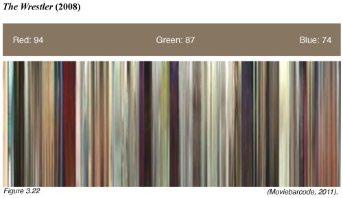
Blue may be an extreme case, and the assaultive experience of being subjected to a single colour for the entire length of a feature film is perhaps unsurprising. However, Sobchack’s approach can be extended to considering the dominant and holistic hues of standard cinematic fare, as will be demonstrated. When one considers a film’s complexion phenomenologically, it provokes a primary response, one that has no immediate cognitive assessment. Consider Aronofsky’s first five feature-length films: I am immediately aware of their chromatic complexion after a single viewing. I feel that The Wrestler is green, and The Fountain is gold, and so on. The impression that colour indelibly stamps on us as embodied spectators, encourages feeling states and leads to the onset of mood.

You can read my entire thesis on Aronofsky and phenomenology by following this link.

A couple of uplifting films

The Road

Perhaps the most depressing film I have ever seen. Moving, sad, and personal, it invaded my mind for days after viewing. The tragic father-son relationship played by Viggo Mortensen and Kodi Smit-McPhee (who would later reprise a similar vulnerable innocence in the excellent Slow West) is wonderfully realised. We never know their names, they are simply Man and Boy, and their anonymity is brutally portrayed as they make their way through a world lost. The Road is a parable of our post apocalyptic fears and it strikes a chord because the premise is a genuine possibility for humanity.


Rating: 5 stars

The Act of Killing

A remarkably unique documentary that accounts the Indonesian genocide of 1965. Having somehow located the genocide’s death-squad leaders (who are now living normal lives in Indonesia, and yet to be brought to justice), director Joshua Oppenheimer, convinces them to re-enact their mass killings under the guise of shooting a Hollywood styled feature film. Oppenheimer presents his subjects with an uncomfortable lightness and humour which is at odds with the subject matter at hand. This juxtaposition only serves to ratchet up the unease as the film progresses. Interesting things begin to happen when the main subject enacts the part of the victim … the result is surprising and disturbing. A chilling reminder of what atrocities every human is capable of.

Whereas The Road suggests a future world where humanity’s deficiencies have prevailed, The Act of Killing underscores similar frailties that have already happened in our past. Both films illustrate the very real and brutal side of human nature. This dark side of humanity is unfortunately all too common when certain conditions are present, and I believe we need to be reminded of this every so often. Hence, I consider these films as essential viewing.


Rating: 4 stars